
Designing a sign-up process for an online bank
Project overview
Imagine using an online bank would be as easy as using an email client. That is the Hani Bank. Hani Bank’s mission is to make sending and receiving money as easy as sending and receiving emails. Services of Hani Bank are available globally. Hani Bank supports all world currencies with instant transfers to banks everywhere. Hani Bank offers personal and business accounts, all available online.
This project was part of my UX design certification.
Project duration
February 2022 – March 2022
The challenge
Opening a bank account is often a messy process with lots of friction. Somehow even for online banks, it is not easy to make opening a bank account easy and comfortable for users.
The goal
Design a sign-up process for an online bank that will be easy to complete.
My role
UX designer designing the website with the sign-up to Hani Bank online, from a concept to the final design.
Responsibilities
The whole UX design process, including user research, wireframing, and prototyping.
User research
I started with the research and conducted interviews with potential users to understand their experience with banks and particularly with online banking.
A primary user group identified through the research was active adults who are technologically savvy.
The research confirmed that users are expecting the sign-up process to be easy and quick, and that current online bank offerings are not meeting their expectations.
Pain points
-
Banking Experience: It is complicated and banks are interested mostly in just selling loans, not providing the tools and support for the key functionalities.
-
Navigation: The banking websites are cluttered with stuff and offers. It is not easy to easily find what one needs.
-
Automation: Users have to do a lot of basic tasks manually even though it would be possible to automate some of them.
-
Lack of functionalities: Banks are focused on selling additional products but not enhancing the key functionalities for payments and transfers.
User Persona
Based on my research I created a user persona representing the target audience.
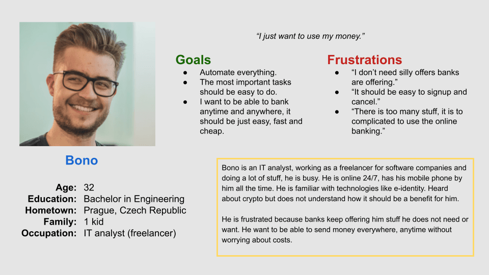
Bono is a busy freelancer who needs to send and receive money flawlessly because he wants to have his finances under control.
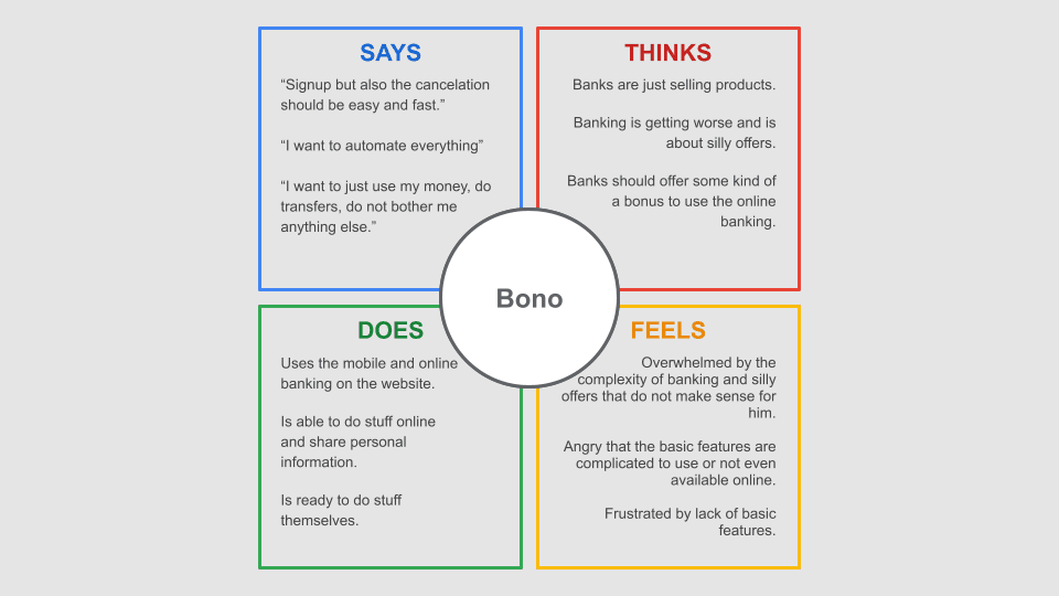
Empathy Map
I wanted to have good insights into my target audience and created an empathy map that would later help me make the right design decisions.
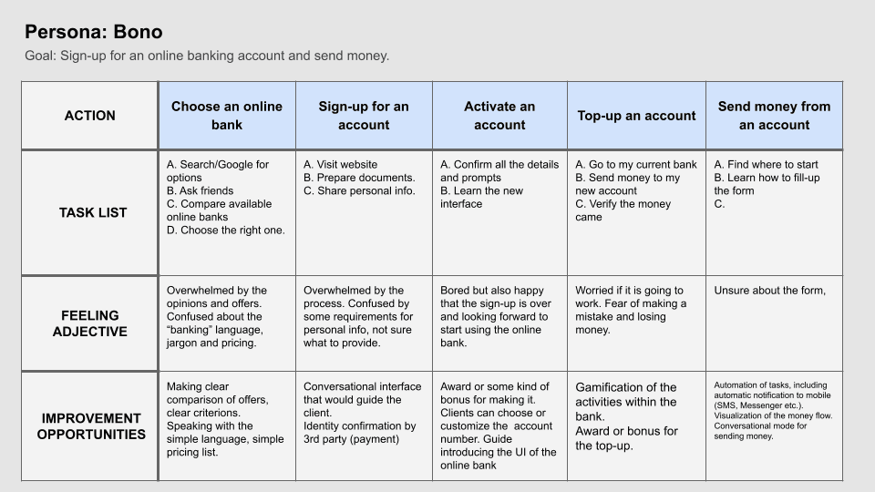
User Journey Map
I continued with mapping the current user experience with the opening of a bank account.
Information architecture
I wanted to set a scope for my design, and have a list of screens with their purpose, and therefore I created a simple sitemap.
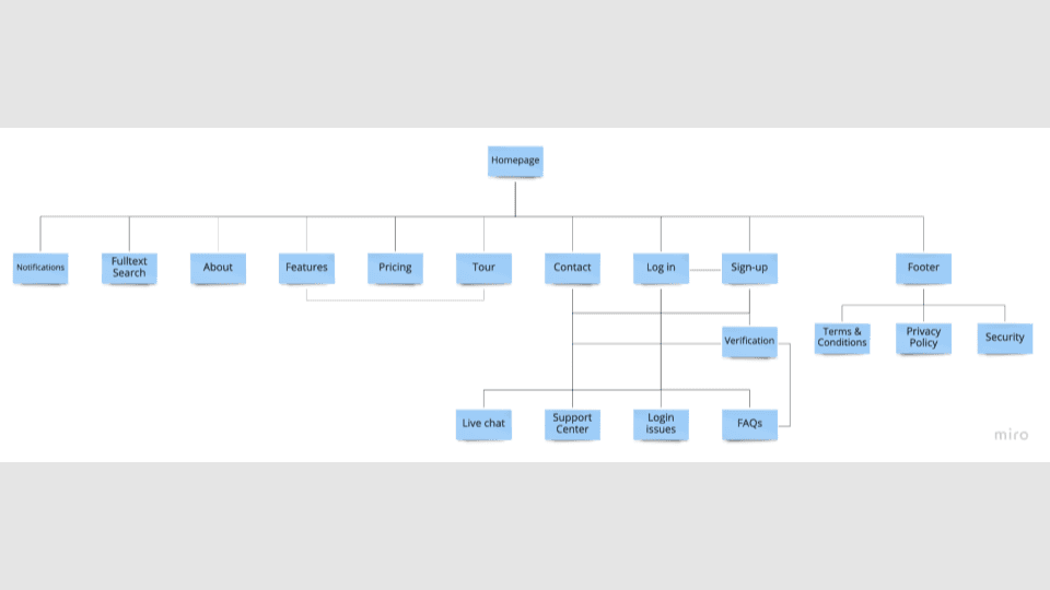
My goal was to make the website "clean" and easy to navigate.
Wireframes
I sketched a few variants of a website on paper, but soon moved to Figma and created digital wireframes.
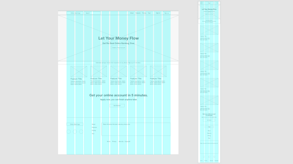
I wanted to find a simple structure that would work for large screens but also for small screens of tablets and cell phones.
Low-fidelity prototype
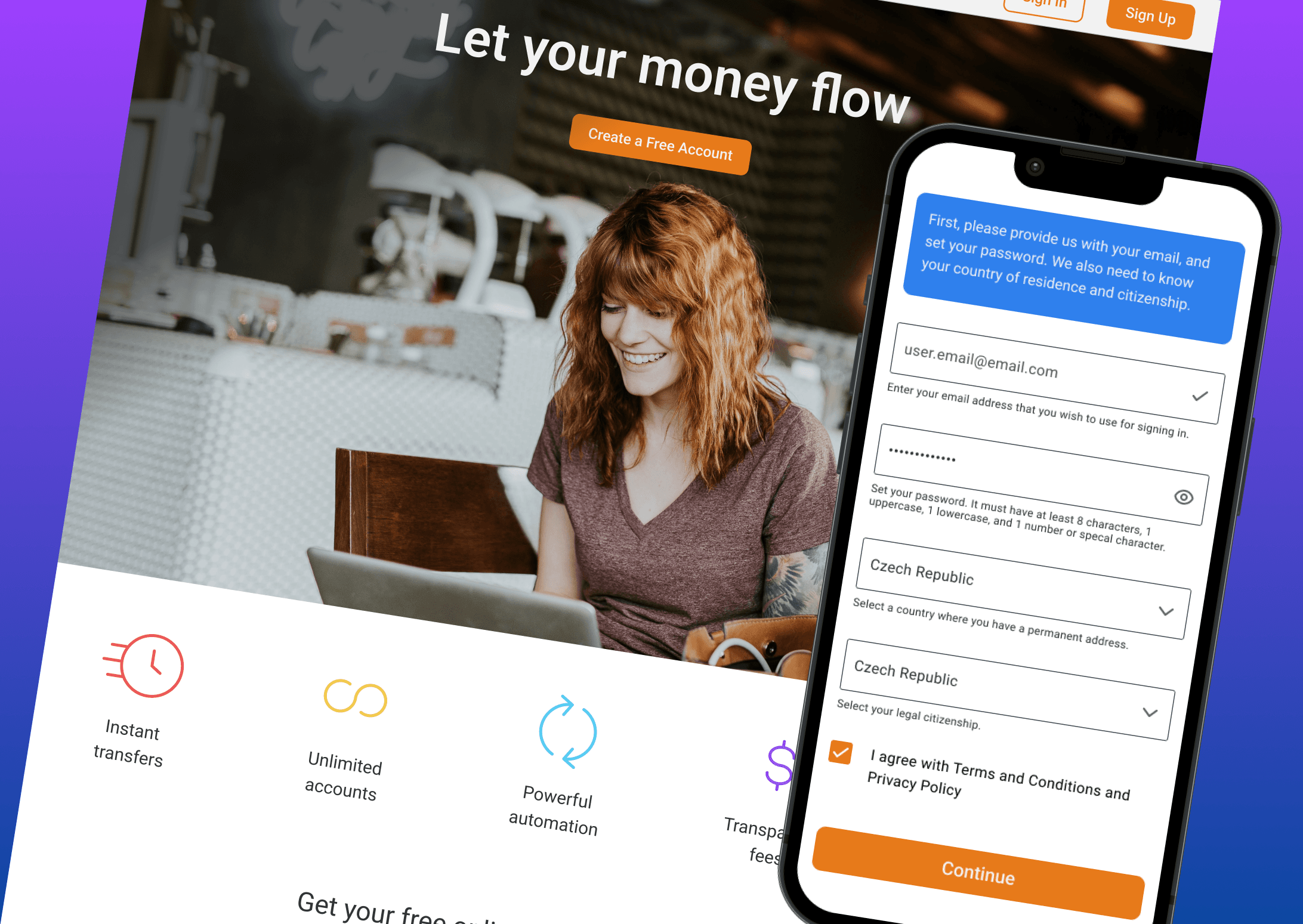
As soon as I was happy with the wireframes I designed a low-fidelity prototype.
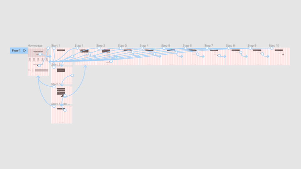
I decided to design the sign-up process as a conversation with a chatbot that would guide the user.
Creating a low-fidelity prototype was a necessary prerequisite for the validation of this decision.
Usability study
I wanted to make sure the sign-up process designed as a conversation would work and therefore I conducted a usability study. It was a moderated usability study I did remotely via video call. I asked users to sign-up for a bank account online using the low-fidelity prototype.
Findings
- The conversational design was not working for most of the users.
- Users were complaining about the copy/texts – too long, and not clear enough.
Based on the findings from the usability study I redesigned the process.
Redesign
I switched to the standard design of a sign-up process using a form and made a chat/conversation mode only an option.
I designed a high-fidelity mockup of the sign-up form.
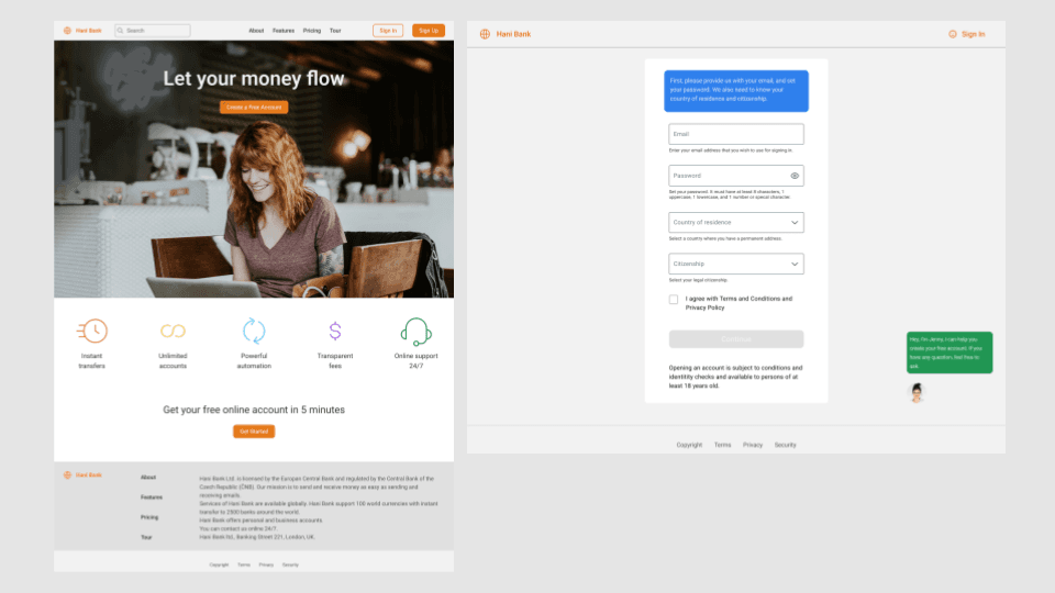
High-fidelity prototype – desktop
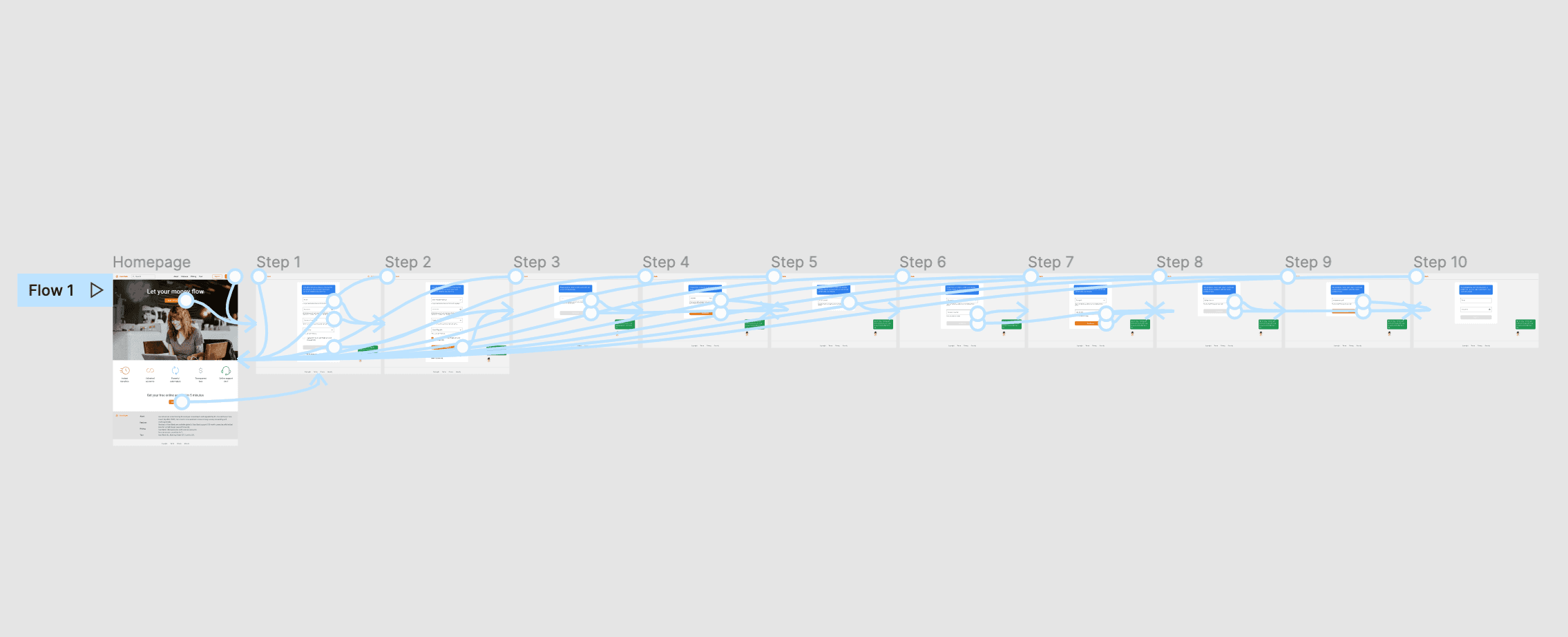
I created the high-fidelity prototype of the whole sign-up process for the desktop.
High-fidelity prototype – mobile
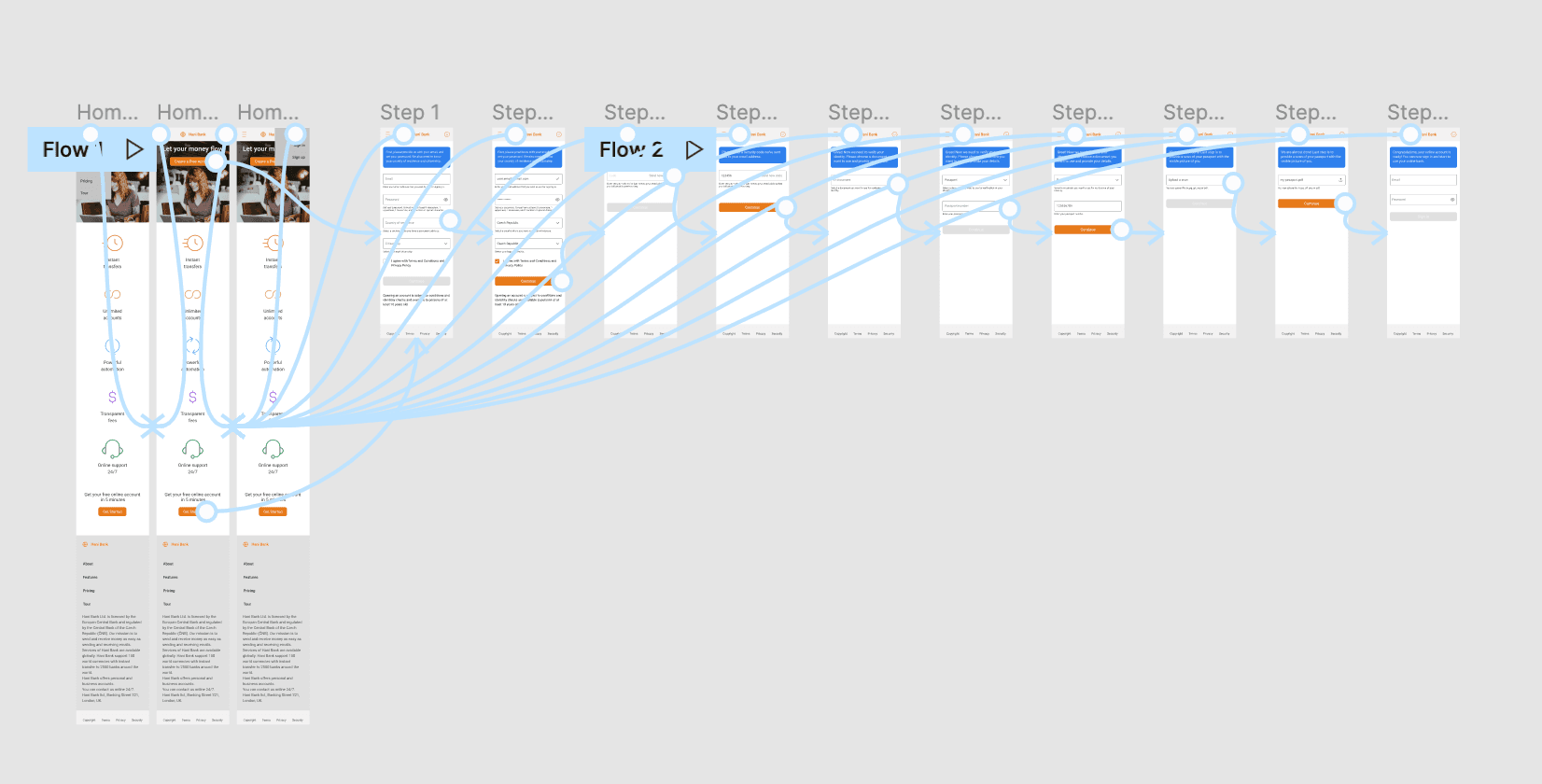
And finished with the high-fidelity prototype for mobile.
Accessibility considerations
-
Bigger font: I used a bigger font and tried to make the texts easy to read.
-
Negative space: I wanted to make the content easy to navigate using a lot of white space, trying to make it clean.
-
Icons: I used icons to communicate the features of online banking.
The result
It is definitely possible to make the sign-up process to an online bank simple. I think the key is to ask users only for the necessary details, not forcing them to provide everything. Lots of verification and checks can be done "behind the scenes" or afterward by the bank itself.
The impact
Making it easy to open a bank account and using online banking is important because it makes modern banking accessible to people who would otherwise be discouraged and would not be able to benefit from managing their money online.
What I learned
- I thought conversation design would be the ideal solution, but it was not. Users wanted to have just a simple form to sign-up, they did not want to chat with a chatbot.
- Writing a copy is very tricky and it requires a lot of effort to make the texts clear and easy to understand.